Behavioural tools in design
Behavioural tools are incredibly useful in designing experiences, and one of these is scarcity. From behavouraleconomics.com:
When an object or resource is less readily available (e.g, due to limited quantity or time), we tend to perceive it as more valuable (Cialdini, 2008). Scarcity appeals are often used in marketing to induce purchases. Marketing messages with limited quantity appeals are thought to be more effective than limited time appeals, because they create a sense of competition among consumers (Aggarwal et al., 2011). An experiment (Lee & Seidle, 2012) that used wristwatch advertisements as stimuli exposed participants to one of two different product descriptions “Exclusive limited edition. Hurry, limited stocks” or “New edition. Many items in stock”. They then had to indicate how much they would be willing to pay for the product. The average consumer was willing to pay an additional 50% if the watch was advertised as scarce.
As with any tool, this can be misused. Booking.com has been accused of misleading customers by giving false accounts of the popularity of rooms, in an investigation by Which?. The approach booking.com was using was to say there was only “1 room left” for a given type of room, when in fact there were multiple rooms available.

The impact of this is to pressure the user into making a purchase.
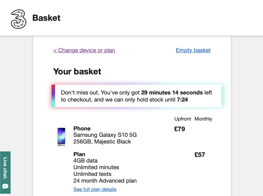
booking.com is not alone in using this type of behavioural approach – Three uses a countdown timer to encourage the user to make a decision:

There is nothing inherently wrong with using behavioural approaches in UX design. In some circumstances it has been found to work extremely well. For instance, in organ donation, where countries automatically opt people in, roughly 80% of people donate. Where countries automatically opt people out, roughly 80% opt out. As organ donation is a positive social good, automatically opting people in would seem to be a positive step.
The question for UX designers is when encouragement passes over into pressure – what could the negative impact be on the person? While I wouldn’t necessarily go so far as to suggest designers need their version of the Hippocratic oath, open discussion about what designers responsibilities are can only encourage more responsible decision making.
Behavioural tools in design Read More »
