Marking optional fields
We’re currently working with a client on a design system to normalise their user interface design. As their software makes extensive use of forms, these have been the subject of considerable discussion, and NNG’s video on marking mandatory fields was shared as part of this.
It’s not often we take issue with NNG, but this is one area where their recommendation to mark mandatory fields with an asterisk is based on poor reasoning. They start out by saying that users don’t read instructions at the top of the page in forms. Absolutely correct! Messages at the start of the form will generally be ignored, so to say ‘Mandatory fields are marked’ or ‘Optional fields are marked’ is a waste of time.
They then say that users will scan the entire form to check for which fields are optional. Wrong! Their initial statement that user just jump in to completing a form is correct. And while users won’t usually read instructions at the top of the page, they will read form labels just before completing the form element – otherwise how else do they know what information they need to provide?
There are 2 things to consider here. The first is how forms are typically designed. Most form elements are mandatory: both form designers and users stay focussed on the task at hand rather than adding information that isn’t of direct value. The second is tone of voice, which we believe is vital. Marking mandatory fields, sometimes in red, affects the tone of voice of the form, and hence the relationship with the user. Imagine the organisation as a person, talking the user through the form. Each asterisk is like the person stabbing a finger at the field and demanding that the user complete it. As the user comes to the form with the expectation that most, if not all fields, are mandatory, then demanding the user do something they expected to do anyway will reduce any positive impression given by using tone of voice well elsewhere! Contrast this with marking optional fields: this is more like having a smart friend helping the user complete the task because they understand how the user is working, and wants to help them get the job done.

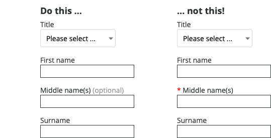
In this example, marking ‘Middle name(s)’ as optional lets the user read the label first, then decide if they want to provide the information. The different styling for ‘(optional)’ provides an additional visual cue that the field is optional which the user can quickly learn to recognise.
Marking optional fields Read More »
