Uncategorized

A legal design case study: Privacy policy

A little while ago I redesigned a privacy policy for a financial advice firm. While there are a lot of examples of visual design available, I don’t feel that editing gets enough love. So I’ve tried to help rectify that with this walkthrough. A few things to be aware of:

  • This is a walkthrough of something I’ve already redesigned – the original work was a lot messier, but would not have been as effective as a case study
  • I plan to develop the IA and some visuals in a subsequent video – let me know if this would be of interest!

A legal design case study: Privacy policy Read More »

When do laws apply

Let’s talk about laws of design.

There’s quite a lot of them: when I was studying human factors I remember learning about Fitts’ Law, Miller’s Law, and Hicks Law. Then there are the Gestalt Laws: the laws of proximity, common region, and Pragnanz.

In general I’m not comfortable with the idea of laws of design: the term ‘law’ suggests something weighty that must always be obeyed. This was brought home to me recently on a legal design project to redesign a privacy policy. The research had been done, the design was in a good place, and on the call was a member of the client’s UX team.

“We’re concerned about Jakob’s Law: this looks very different to what people are used to, so they might be confused.”

Now, pay attention, those at the back: one of the main reasons we do legal design is because almost all legal documents are really badly designed (even though someone with a design role hasn’t been near these documents, it doesn’t change the fact that the design is awful: ‘no design’ is bad design).

I’m not arguing that Jakob’s Law isn’t A Thing™: people really do spend most of their time on sites from other people. What I dislike is the weight implied by the word Law that perhaps contributed to this person misapplying the idea.

One of the reasons I set out the rationale for design decisions is because in one of my early UX roles, people relied heavily on Jakob’s Law, generally expressed in the form of ‘Oooh, but [insert competitor name] doesn’t do it like that’, and for some reason responding “So what?” made them a bit prickly (I’m joking; I only did that a couple of times). 

The point is that laws are interesting and useful, but despite the name, you need to understand where the laws have come from and more importantly, where they should be applied.

When do laws apply Read More »

Contract smells, or what lawyers can learn from software engineers

As a lapsed, or possibly defrocked, computer scientist, it’s interesting to see how lessons learned in software engineering can be applied to legal design. The fields are more closely related than you might initially expect:
“Programmers rate themselves almost exclusively by these two rubrics: how challenging is the field and toolset, and how virtuoso are their talents.” — Alan Cooper

I’m sure this resonates with lawyers! Both lawyers and software engineers:

  • use words in a formal way to meet a functional or legal requirement;
  • often have to change something that has evolved over a long period of time, originally created or extensively edited by someone else;
  • reuse content to work more efficiently: software engineers reuse code from libraries and write new functions to be reused within the codebase, while lawyers adapt existing contracts or cut and paste clauses from an existing contract; and
  • add content to meet requirements that may disappear over time, but which is maintained regardless. 

Taking the wider view

One measure for code effectiveness is execution speed: how fast does it run? But from a broader perspective, software engineers consider how quickly someone new to the codebase (or themselves, returning to the codebase after working on something else) can understand it, in order to change it. Arguably this is more important than raw execution speed, because it means that the organisation is able not just to deliver the functionality needed, but to do so reliably and to add more functionality over time. This is why well‑written code, with good documentation, is so important: it’s not enough that the code works, it needs to be well written so that someone can understand and change it. There’s a saying:

“Always code as if the guy who ends up maintaining your code will be a violent psychopath who knows where you live. Code for readability.” – John F. Woods

But deadlines need to be met, and code may be delivered that meets the immediate requirement but would be hard to understand and maintain. This is one of the reasons refactoring was introduced, as a way to improve how the code is written (making maintenance and future work easier) without changing what the code does or how it interfaces with other software. To address this, software engineers refactor code. This might involve:

  • reducing complex conditional statements and breaking long methods into smaller, single-purpose functions;
  • putting commonly used code into reusable functions;
  • making the names of variables, functions, and classes clearer;
  • splitting large blocks of code into smaller, more modular components;
  • removing duplicate code by applying the ‘Don’t Repeat Yourself’ principle; and
  • adding comments and formatting code consistently. 

Why you need to smell your contracts

Contracts are often written as though the only thing that matters is the robustness of the legal provisions: this is the contract equivalent of software that delivers functionality at the expense of understanding and maintainability.

In software engineering, the term ‘code smell’ (which I think is fabulous!) is used to describe a sign that the code may need refactoring. In legal documents, ‘contract smells‘ include:

  • Text you don’t need: This is the low‑hanging fruit of refactoring: phrases like ‘from time to time’; ‘nothing in this contract’, and ‘set out below’. Many contracts include definitions that are in everyday use: if they are in common use, you don’t need to define them.
  • Wordy phrases: Some text is just too long, for example ‘includes, but is not limited to’ can be replaced with ‘includes’: ‘is not limited to’ is implicit.
  • Long clauses or sentences: Can you read your sentence without drawing breath? Is the clause trying to cover too much? Consider breaking it down into multiple sentences or by using bullets. 
  • Legal language: Most legal documents are written as though the only audience is going to be other lawyers. Replace legal terms with more commonly terms. 
  • Wall of text: Is the content easy to navigate with clear headings and structure, or is it an intimidating wall of copy?  
  • Monolithic formatting: Does the contract use SHOUTY BLOCK CAPS or more relaxed typography?

Addressing these contract smells doesn’t change the legal meaning or robustness of a contract, but it does make it easier to understand and extend. One of the common misconceptions of legal design is that ‘easier to understand’ is just aimed at non-lawyers: this is simply not true. Put someone – even a skilled lawyer – under stress and give them the choice of working with a contract that is a wall of text or a contract that uses well-structured, easy to read text, and they will choose the better design every time. 

Contract smells, or what lawyers can learn from software engineers Read More »

UX for founders

tl;dr

For founders, UX is about optimsing the design and build process, to build the right thing for the right audience. Remember: it’s about how it works, not how it looks!

Introduction

Over the last few years I’ve spoken to a number of founders about UX, and how it can help. Even long-established businesses fall prey to the misunderstanding that UX is about how something looks, so I usually end up having a conversation where the key takeaway is some variant of the old adage:

Design is about how it works, not about how it looks.

Now this isn’t to say that the looks are unimportant or that a UX designer isn’t going to deliver something that’s visually attractive: the aesthetic-usability effect means that visually attractive designs are perceived as more intuitive than less attractive designs. But for founders, UX should be about optimising the process of design and build.

So you’re a bright-eyed founder, ready to build your dream and set the world ablaze with your brilliant idea. You’ve done some market research that’s told you that even outside your immediate family and friends, there are people willing to pay Real Cash Money for the idea! Why shouldn’t you jump right in and start developing?

User research

Market research at this early stage tells you if there’s merit in your idea: is it solving a real need? If it is, then you want to dig deeper to understand:

  • Who is going to be using your product
  • How you can design it around their needs

This is where user research comes in. You’ll have some idea about who will be using your product. User research will help you get a clearer picture of your users are so that you can:

  • Design in a way that meets their needs
  • Uncover additional needs they may have that could inform your product roadmap
  • Prioritise features that matter most to your users so they get more value, more quickly.

Prototyping

Next, you can apply this understanding to your design, in the form of a prototype. Prototyping doesn’t offer all of the functionality of real software, but it means you can experiment with ideas in a way that is faster and cheaper than doing it in real code. You can also test your prototypes: get them in front of prospective users, see what works and what doesn’t. Once you’ve defined how the software should behave for the user, the designer will then work with your development team to create a spec that they can build from, leading to fewer code changes and reduced cost. 

Summary

UX can be a complicated field: the number of job titles alone can make it a daunting prospect! But for a founder, the best advice is to focus on UX as a way of reducing the risk of going to market with the wrong product, designed for the wrong audience. 

UX for founders Read More »

Marking optional fields

We’re currently working with a client on a design system to normalise their user interface design. As their software makes extensive use of forms, these have been the subject of considerable discussion, and NNG’s video on marking mandatory fields was shared as part of this. 

It’s not often we take issue with NNG, but this is one area where their recommendation to mark mandatory fields with an asterisk is based on poor reasoning. They start out by saying that users don’t read instructions at the top of the page in forms. Absolutely correct! Messages at the start of the form will generally be ignored, so to say ‘Mandatory fields are marked’ or ‘Optional fields are marked’ is a waste of time.

They then say that users will scan the entire form to check for which fields are optional. Wrong! Their initial statement that user just jump in to completing a form is correct. And while users won’t usually read instructions at the top of the page, they will read form labels just before completing the form element – otherwise how else do they know what information they need to provide?

There are 2 things to consider here. The first is how forms are typically designed. Most form elements are mandatory: both form designers and users stay focussed on the task at hand rather than adding information that isn’t of direct value. The second is tone of voice, which we believe is vital. Marking mandatory fields, sometimes in red, affects the tone of voice of the form, and hence the relationship with the user. Imagine the organisation as a person, talking the user through the form. Each asterisk is like the person stabbing a finger at the field and demanding that the user complete it. As the user comes to the form with the expectation that most, if not all fields, are mandatory, then demanding the user do something they expected to do anyway will reduce any positive impression given by using tone of voice well elsewhere! Contrast this with marking optional fields: this is more like having a smart friend helping the user complete the task because they understand how the user is working, and wants to help them get the job done.
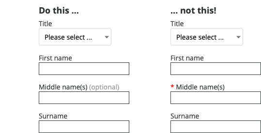
In this example, marking ‘Middle name(s)’ as optional lets the user read the label first, then decide if they want to provide the information. The different styling for ‘(optional)’ provides an additional visual cue that the field is optional which the user can quickly learn to recognise.

Marking optional fields Read More »

Behavioural tools in design

Behavioural tools are incredibly useful in designing experiences, and one of these is scarcity. From behavouraleconomics.com:

When an object or resource is less readily available (e.g, due to limited quantity or time), we tend to perceive it as more valuable (Cialdini, 2008). Scarcity appeals are often used in marketing to induce purchases. Marketing messages with limited quantity appeals are thought to be more effective than limited time appeals, because they create a sense of competition among consumers (Aggarwal et al., 2011). An experiment (Lee & Seidle, 2012) that used wristwatch advertisements as stimuli exposed participants to one of two different product descriptions “Exclusive limited edition. Hurry, limited stocks” or “New edition. Many items in stock”. They then had to indicate how much they would be willing to pay for the product. The average consumer was willing to pay an additional 50% if the watch was advertised as scarce.

As with any tool, this can be misused. Booking.com has been accused of misleading customers by giving false accounts of the popularity of rooms, in an investigation by Which?. The approach booking.com was using was to say there was only “1 room left” for a given type of room, when in fact there were multiple rooms available.

The impact of this is to pressure the user into making a purchase. 

booking.com is not alone in using this type of behavioural approach – Three uses a countdown timer to encourage the user to make a decision:

Three’s basket screen showing a countdown timer

There is nothing inherently wrong with using behavioural approaches in UX design. In some circumstances it has been found to work extremely well. For instance, in organ donation, where countries automatically opt people in, roughly 80% of people donate. Where countries automatically opt people out, roughly 80% opt out. As organ donation is a positive social good, automatically opting people in would seem to be a positive step. 

The question for UX designers is when encouragement passes over into pressure – what could the negative impact be on the person? While I wouldn’t necessarily go so far as to suggest designers need their version of the Hippocratic oath, open discussion about what designers responsibilities are can only encourage more responsible decision making. 

Behavioural tools in design Read More »

Accessibility matters

In every organisation, there is some aspect of UX that needs to be ‘sold’. It may be user research, or testing, but by far the most common aspect of UX that people need to be convinced of is accessibility.

A young man died recently from a fatal allergic reaction to dairy at the Byron burger chain. From the BBC News article:

    Clodagh Bradley QC, representing the Carey family, of Crowborough, Sussex, said regulations required allergy information in a restaurant to be clearly visible.
    Information on the Byron menu was “at the very bottom, in a really very small font, in black print, on a royal blue background” making it difficult to read, she added.
    Ms Leitner-Hopps [Byron technical manager] said: “It’s perfectly legible in my opinion.”

Black print, on a royal blue background? And in a “very small font”? It’s no wonder the information was missed – and even though the menu also has an instruction to tell staff about allergies, placing the responsibility on the customer when a life is at risk simply isn’t acceptable.

Accessibility matters, not only in circumstances like this, but simply because making your product or service accessible means making it accessible to as many customers as possible – and that’s just good business. 

Accessibility matters Read More »